Sky VIP hub
Sky VIP hub
Sky VIP hub
Redesigning Sky's loyalty hub to increase engagement and customer retention.
I led the end-to-end strategy and design for the new VIP experience in the My Sky app, partnering with Product, Engineering, external agencies and Sky VIP leadership to define the North Star and secure CPO-level alignment.
Two experiments increased reward engagement by +1.54pp, contributing to 590+ accounts saved and +0.53pp engagement, resulting in 60+ accounts saved during the experiments.
Impact
590+
Accounts saved
+1.54pp
Reward engagement
+1.54pp
Reward engagement
Objectives
Why redesign the VIP hub?
The VIP propositions team at Sky had spent six months re-defining Sky's loyalty program. Sky's loyalty rewards can only be accessed through the My Sky app. Our team was tasked with re-designing the VIP hub to support the new program and giving the hub a complete re-design.
Success metrics
Increased engagement with the VIP hub
Increased engagement with the VIP hub
Increased engagement with the VIP hub
Less than 20% of the MySky customer base were engaging with the VIP hub.
Less than 20% of the MySky customer base were engaging with the VIP hub.
Less than 20% of the MySky customer base were engaging with the VIP hub.
Reduced churn rate
The data team had identified a trend of customers who engage with at least four rewards a month having a lower chance of leaving Sky.
Increase rewards conversion
Customers regularly claiming rewards will grow more engaged with the hub.
Discovery
Identifying pain points and opportunities

Seeing how we compare
I kicked off desk research with a heuristic analysis of the current Sky VIP hub and conducting a competitor analysis of both direct and in-direct loyalty experiences, with a focus on native apps.
Key themes
Search and filtering, location based search.
Variety in UI elements makes it easier to identify onwards journeys and specific actions.
How it works and tiering explainers.
Unlock rewards features.
More engaging reward details pages.
Gamification.
Seeing how we compare
I kicked off desk research with a heuristic analysis of the current Sky VIP hub and conducting a competitor analysis of both direct and in-direct loyalty experiences, with a focus on native apps.
Key themes
Search and filtering, location based search.
Variety in UI elements makes it easier to identify onwards journeys and specific actions.
How it works and tiering explainers.
Unlock rewards features.
More engaging reward details pages.
Gamification.
Current estate and architecture
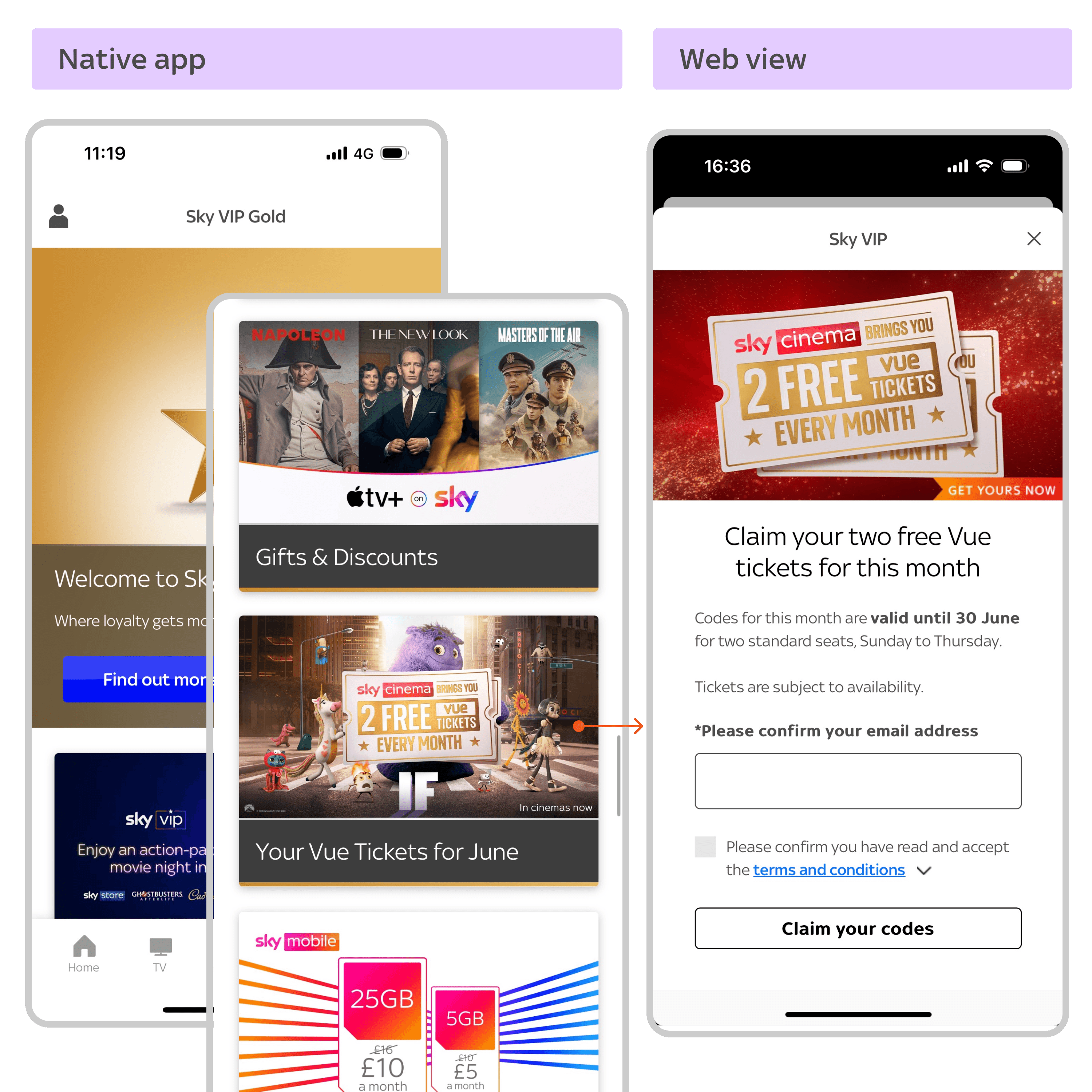
The Sky VIP hub consists of an app native landing page, while most of the onwards journey are web pages that are built and managed by an external agency.
Consolidating the native and web journeys to feel like one cohesive experience was an important consideration.
Current estate and architecture
The Sky VIP hub consists of an app native landing page, while most of the onwards journey are web pages that are built and managed by an external agency.
Consolidating the native and web journeys to feel like one cohesive experience was an important consideration.

Upfront user testing
I ran a UserZoom survey including 100 participants and a think-aloud task including 15 participants.
The participants were existing Sky customers. They were tasked with browsing a prototype of the hub and finding rewards that they themselves would like to claim.
Key themes
Finding relevant rewards
Customers struggled to find the filters and often commented on wanting to find events local to them.
Getting lost
Customers would find a reward that piqued their interest and then struggle to find it again. They would also struggle to re-locate the filters.
Clarity and comprehension
Some customers didn’t understand that Sky VIP is available to all customers and thought it’s a special program that needs to be opted into or that costs extra.
Upfront user testing
I ran a UserZoom survey including 100 participants and a think-aloud task including 15 participants.
The participants were existing Sky customers. They were tasked with browsing a prototype of the hub and finding rewards that they themselves would like to claim.
Key themes
Finding relevant rewards
Customers struggled to find the filters and often commented on wanting to find events local to them.
Getting lost
Customers would find a reward that piqued their interest and then struggle to find it again. They would also struggle to re-locate the filters.
Clarity and comprehension
Some customers didn’t understand that Sky VIP is available to all customers and thought it’s a special program that needs to be opted into or that costs extra.
Strategy
Bringing it all together
I consolidated all of the findings from the heuristic analysis, competitor analysis and upfront research into a deck outlining pain points and solutions under each theme to present back to VIP leadership.

NEXT STEPS
I created a proposal for how we should action these findings.
Proposed solutions
Improve hub navigation with clearer rewards categorisation
Re-think, test and iterate the taxonomy of the rewards to help customers scan the page for what’s relevant to them.
Hero what’s relevant
Surfacing things that are most relevant to customers will increase perceived value and engagement with the program.
Optimise VIP explainer page and promotions to improve clarity
Make it clear that VIP is a loyalty program and doesn't cost anything. Create standardised templates for rewards pages.
Improve search and fitering
This was the highest requested improvement in the survey.
NEXT STEPS
I created a proposal for how we should action these findings.
Proposed solutions
Improve hub navigation with clearer rewards categorisation
Re-think, test and iterate the taxonomy of the rewards to help customers scan the page for what’s relevant to them.
Hero what’s relevant
Surfacing things that are most relevant to customers will increase perceived value and engagement with the program.
Optimise VIP explainer page and promotions to improve clarity
Make it clear that VIP is a loyalty program and doesn't cost anything. Create standardised templates for rewards pages.
Improve search and fitering
This was the highest requested improvement in the survey.
Ideation
Building relationships through collaboration

Sketching session
PM Dave Howe and I held a workshop with the VIP Propositions Team, Sky developers, developers from an external agency that manages the rewards and reward pages, and a few designers from my team.
The PM went through the objectives, the VIP team ran through the new props and I ran through the current hub experience, competitor analysis, research findings and key themes. I ran a crazy 8’s ideation task using the themes as how might we's and everyone took a few minutes to talk through their ideas and dot vote. Some popular solutions had clearly emerged.
Sketching session
PM Dave Howe and I held a workshop with the VIP Propositions Team, Sky developers, developers from an external agency that manages the rewards and reward pages, and a few designers from my team.
The PM went through the objectives, the VIP team ran through the new props and I ran through the current hub experience, competitor analysis, research findings and key themes. I ran a crazy 8’s ideation task using the themes as how might we's and everyone took a few minutes to talk through their ideas and dot vote. Some popular solutions had clearly emerged.

KICKING OFF DESIGN EXPLORATION
Considering all that we wanted to go after, I created a design to do list and prioritised items that would support the new props for the hub and address the biggest pain points identified during user testing.
I organised weekly playbacks with the VIP team.
The first week I showcased ideation on the hero section to support the new props, improved hub IA, introducing new merchandising components, filtering approach options, and reward detail page templates to make it easier to identify the key offerings of the reward and key information such as dates for events.
KICKING OFF DESIGN EXPLORATION
Considering all that we wanted to go after, I created a design to do list and prioritised items that would support the new props for the hub and address the biggest pain points identified during user testing.
I organised weekly playbacks with the VIP team.
The first week I showcased ideation on the hero section to support the new props, improved hub IA, introducing new merchandising components, filtering approach options, and reward detail page templates to make it easier to identify the key offerings of the reward and key information such as dates for events.
Solution
Optimised filtration, cleaner taxonomy and delightful moments
Blue Sky prototype
The Blue Sky prototype included a focus on highlighting the customers current tier and what they get, a dynamic hero section for regularly claimed rewards, the introduction of search and filtering on the hub, a new taxonomy for the rewards and an optimised claiming journey.
The new propositions and prototype were presented to and well received by Ann-Marie McKay, Sky's CPO. Gaining buy in for us to continue with the re-design.
Blue Sky prototype
The Blue Sky prototype included a focus on highlighting the customers current tier and what they get, a dynamic hero section for regularly claimed rewards, the introduction of search and filtering on the hub, a new taxonomy for the rewards and an optimised claiming journey.
The new propositions and prototype were presented to and well received by Ann-Marie McKay, Sky's CPO. Gaining buy in for us to continue with the re-design.
Refinement
Breaking down the first release
I worked closely with Sky Tech Leads and technical contacts from two external agencies to breakdown the features and decide what would be feasible for the first release.
Phase 1 prototype
The first release would focus on supporting the new props in the page header section using an existing carousel component, bringing the pages managed by one of the external agencies inline with our design system, optimising the claim cinema tickets pages, and introducing a discounts hub with a new external partner.
Phase 1 prototype
The first release would focus on supporting the new props in the page header section using an existing carousel component, bringing the pages managed by one of the external agencies inline with our design system, optimising the claim cinema tickets pages, and introducing a discounts hub with a new external partner.

Cohesion between platforms
I worked closely with developers from the agency Stretch to create a localised design system on their side based on our system: Sky UI.
I requested markup and styling code from the Sky UI developers to help speed up the development process for Stretch and ensure consistency.
All of the onwards journeys and entry forms from the VIP hub now fit cohesively with the overall Sky digital eco-system.
Cohesion between platforms
I worked closely with developers from the agency Stretch to create a localised design system on their side based on our system: Sky UI.
I requested markup and styling code from the Sky UI developers to help speed up the development process for Stretch and ensure consistency.
All of the onwards journeys and entry forms from the VIP hub now fit cohesively with the overall Sky digital eco-system.

Supplementing the system
I created components and page templates for Stretch to build and maintain in their system that weren't available in Sky UI.
Supplementing the system
I created components and page templates for Stretch to build and maintain in their system that weren't available in Sky UI.
Validation
User testing phase 1
Upfront user testing
I ran a UserZoom survey including 100 participants and a think-aloud task including 15 participants.
The test was structured similar to the upfront testing, in order to compare survey results. With some additional comprehension testing on certain labels.
Outcome
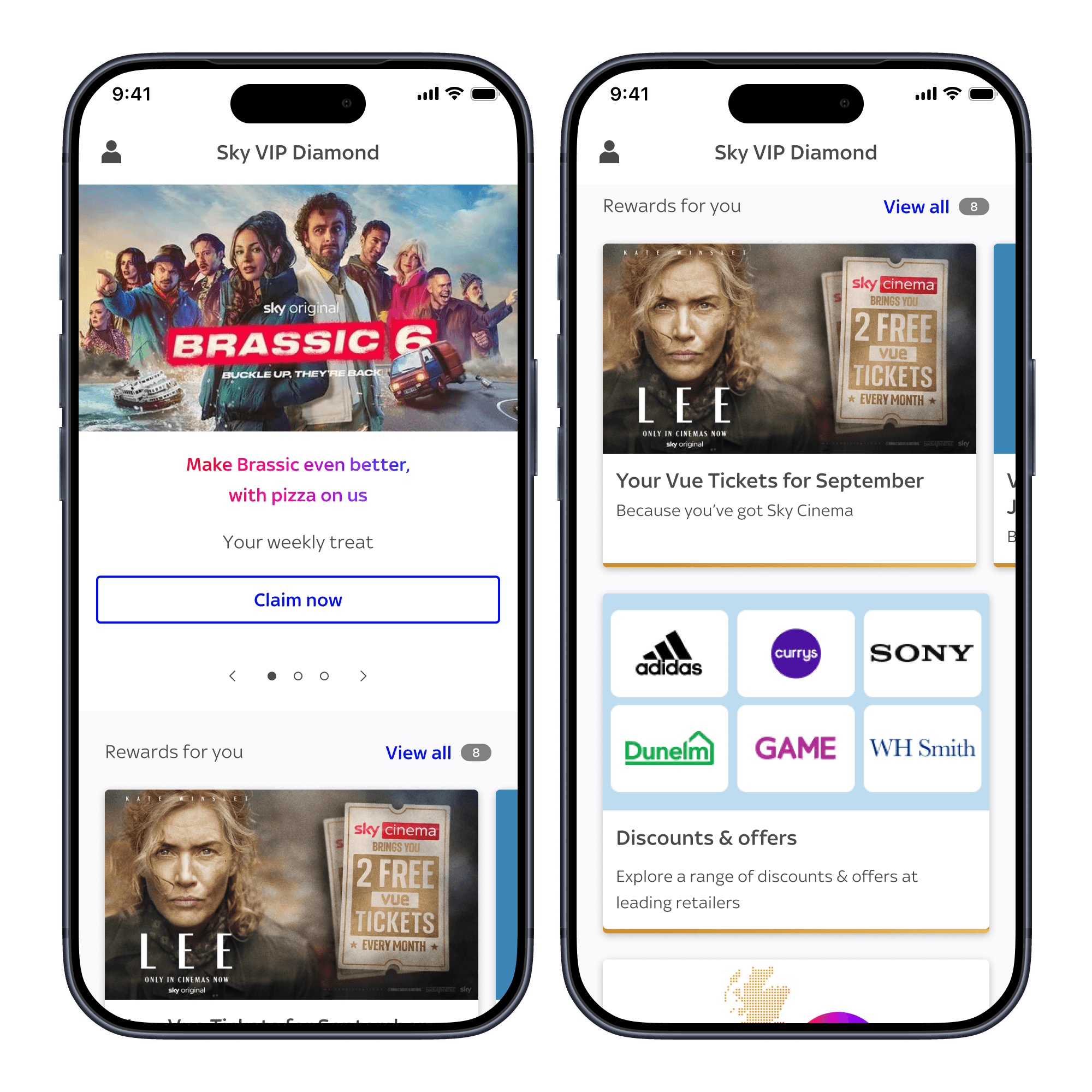
5/10 interacted with the hero carousel
6/10 interacted with the top picks carousel
46/100 demonstrated understanding what "Because you've got Sky Cinema" meant
57/100 demonstrated understanding what "Rewards for you" meant
+20pp selected "Excited" when asked how they felt browing the VIP hub compared to upfront test
Upfront user testing
I ran a UserZoom survey including 100 participants and a think-aloud task including 15 participants.
The test was structured similar to the upfront testing, in order to compare survey results. With some additional comprehension testing on certain labels.
Outcome
5/10 interacted with the hero carousel
6/10 interacted with the top picks carousel
46/100 demonstrated understanding what "Because you've got Sky Cinema" meant
57/100 demonstrated understanding what "Rewards for you" meant
+20pp selected "Excited" when asked how they felt browing the VIP hub compared to upfront test
Next steps
Further exploration into product specific rewards
Further exploration into product specific rewards
Further exploration into product specific rewards
Look to improve comprehension from 46/100 to at least 70/100.
Look to improve comprehension from 46/100 to at least 70/100.
Look to improve comprehension from 46/100 to at least 70/100.
Further exploration into "Rewards for you" labelling
2 participants confused these with personalised recommendations.
Investigate increasing interaction with carousels
Explore a more engaging UI execution or more enticing copy.
Outcome
First release experiment
Results
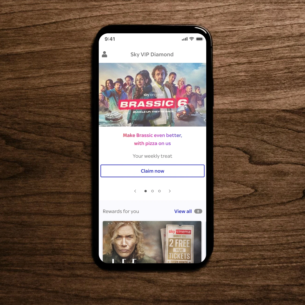
The first release went out as an experiment, replacing the hero section with a carousel of featured rewards and saw an account churn rate reduction of 590 My Sky app VIP users. The second experiment introducing the “Rewards for you” carousel beneath the hero carousel achieved an account churn benefit of 60 accounts. The updates to bring onwards journeys inline with our design system has been released, creating an overall cohesive experience for the hub.
Results
The first release went out as an experiment, replacing the hero section with a carousel of featured rewards and saw an account churn rate reduction of 590 My Sky app VIP users. The second experiment introducing the “Rewards for you” carousel beneath the hero carousel achieved an account churn benefit of 60 accounts. The updates to bring onwards journeys inline with our design system has been released, creating an overall cohesive experience for the hub.