Sky Re-contracting
Sky Re-contracting
Sky Re-contracting
Redesigning how Sky customers re-contract, increasing digital conversion by up to 51%.
I led the end-to-end strategy and design of a new re-contracting experience, addressing conversion barriers while introducing greater flexibility for customers to understand, compare and right-size their packages. I partnered with Technology to establish a phased roadmap and secured Director-level backing for the North Star vision.
Impact
+51%
Conversion from entry point optimisation
+8.2k
Orders from journey optimisation
+8.2k
Orders from journey optimisation

THE OBJECTIVE
Only 12% of customer's re-contracting through Sky were using the digital channels. Our team were tasked with identifying why this might be and increasing the percentage of customers re-contracting online rather than calling.
THE OBJECTIVE
Only 12% of customer's re-contracting through Sky were using the digital channels. Our team were tasked with identifying why this might be and increasing the percentage of customers re-contracting online rather than calling.
GOALS
Reduce calls
Reduce the amount of customers phoning up about re-contracting.
Reduce churn
Reduce the amount of customers choosing to leave Sky at the point of re-contracting.
Introduce right-sizing capabilities
Design a journey that enables customers to add and remove from their TV package, and change their Broadband speed - something they could do by calling up but not online.

PAIN POINTS
Using data provided from call listening insights and Content Square (funnel) data.
I mapped out the current end to end journey and held a workshop with the PM and researcher where we mapped identified pain points from the data provided to potential triggers and steps in the journey. I added comments based on heuristics and usability best practices. To help identify where the biggest pain points are and form an order of priority of what to focus on first.
We discovered the bundle (landing) page had the most usability and comprehension issues that could lead to dropouts, with only 10% of users clicking the main CTA.
This led to four key themes to start with:
Comprehension on current product holding and price.
Poor Visual Design and UI best practices impacting usability.
Inability to compare current contract to new.
Lack of package editing functionality.
PAIN POINTS
Using data provided from call listening insights and Content Square (funnel) data.
I mapped out the current end to end journey and held a workshop with the PM and researcher where we mapped identified pain points from the data provided to potential triggers and steps in the journey. I added comments based on heuristics and usability best practices. To help identify where the biggest pain points are and form an order of priority of what to focus on first.
We discovered the bundle (landing) page had the most usability and comprehension issues that could lead to dropouts, with only 10% of users clicking the main CTA.
This led to four key themes to start with:
Comprehension on current product holding and price.
Poor Visual Design and UI best practices impacting usability.
Inability to compare current contract to new.
Lack of package editing functionality.
DOING THE RIGHT THING
Call listening insights suggested customers often aren’t alerted of the new contract and only find out when they are billed a higher amount than they weren’t expecting - leading to bill shock.
This is causing a huge amount of frustration for our customers and leading to mistrust in Sky. Reviewing the entry points and alerting methods, and ensuring we make pricing clear is a huge opportunity to make improvements for both the business and customer.
DOING THE RIGHT THING
Call listening insights suggested customers often aren’t alerted of the new contract and only find out when they are billed a higher amount than they weren’t expecting - leading to bill shock.
This is causing a huge amount of frustration for our customers and leading to mistrust in Sky. Reviewing the entry points and alerting methods, and ensuring we make pricing clear is a huge opportunity to make improvements for both the business and customer.
HOW WE COMPARE
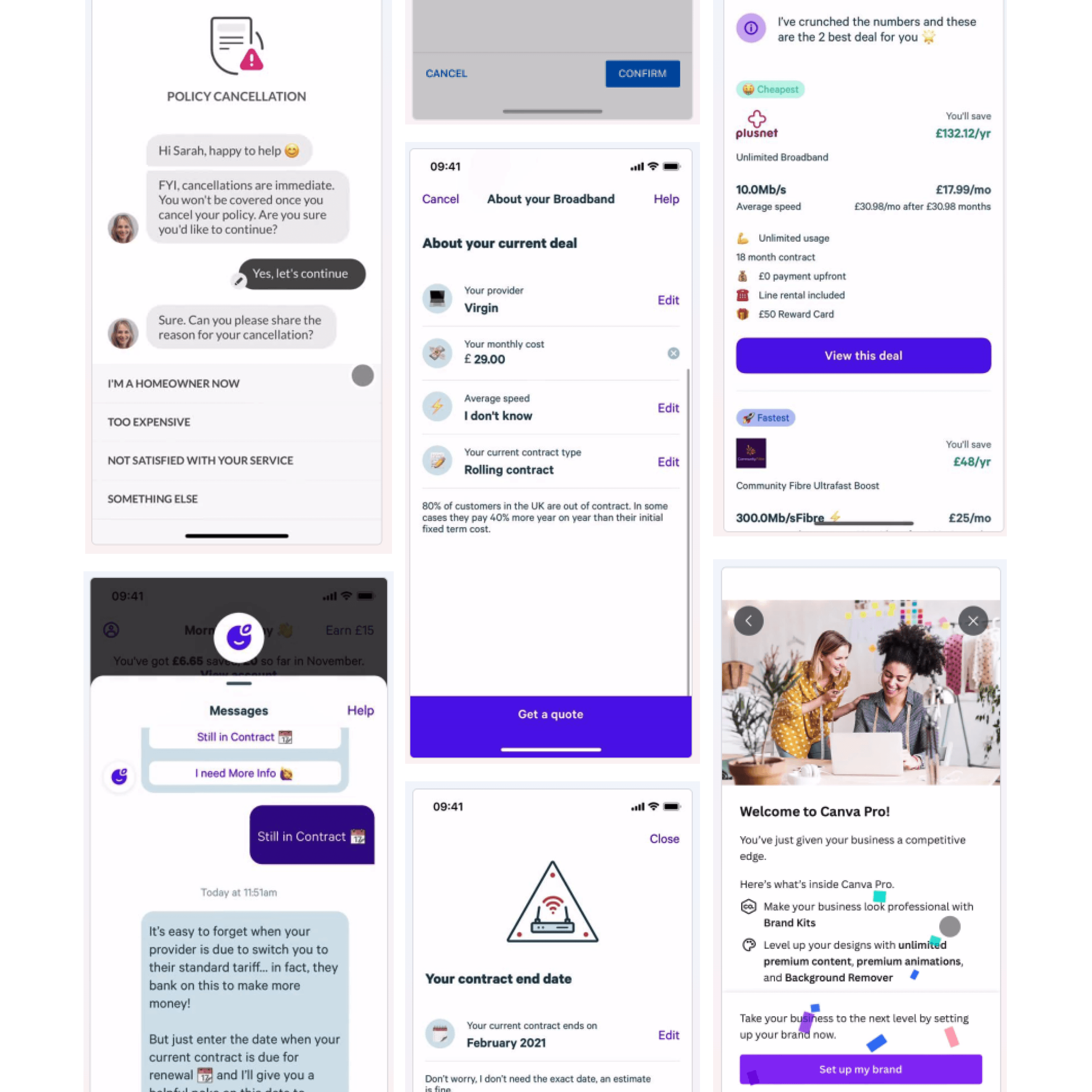
I conducted a competitor analysis on both direct and indirect competitors. Looking to other industries to gain inspiration.
Key themes
Well structured UIs that are easy to scan for key information, using lists and tables in an itemised view.
Apple Pay, Google Pay and stored cards for quick and easy payments.
Chatbots incorporated into the cancellation process.
Chatbots or message with agent interactions for answering queries.
Celebratory moments at the point of sign-up.
HOW WE COMPARE
I conducted a competitor analysis on both direct and indirect competitors. Looking to other industries to gain inspiration.
Key themes
Well structured UIs that are easy to scan for key information, using lists and tables in an itemised view.
Apple Pay, Google Pay and stored cards for quick and easy payments.
Chatbots incorporated into the cancellation process.
Chatbots or message with agent interactions for answering queries.
Celebratory moments at the point of sign-up.

KICKING OFF IA & UX
I looked at each page individually and came up with multiple approaches to address the IA and content on the page.
I considered the commercial goal of increasing online contracts while addressing the customer pain points and explored ideas to reinforce the value of Sky - such as showing when customers would be moving up a loyalty tier and using personalisation to show upcoming seasons of shows they had been watching.
KICKING OFF IA & UX
I looked at each page individually and came up with multiple approaches to address the IA and content on the page.
I considered the commercial goal of increasing online contracts while addressing the customer pain points and explored ideas to reinforce the value of Sky - such as showing when customers would be moving up a loyalty tier and using personalisation to show upcoming seasons of shows they had been watching.

ADDRESSING PAIN POINTS
Considering the key pain points and objectives, I broke the work down into three areas of focus:
Entry points and alerting:
Informing customers of their options will reduce bill shock.
Comparing old package to new:
Giving customers the information they need will help them feel assured to re-contract online without needing to call or exit the journey to check their current bill.
Edit package flows:
Letting customers right size their package in the digital re-contracting journey will negate the need to call.
ADDRESSING PAIN POINTS
Considering the key pain points and objectives, I broke the work down into three areas of focus:
Entry points and alerting:
Informing customers of their options will reduce bill shock.
Comparing old package to new:
Giving customers the information they need will help them feel assured to re-contract online without needing to call or exit the journey to check their current bill.
Edit package flows:
Letting customers right size their package in the digital re-contracting journey will negate the need to call.

VISUAL DESIGN & UI
I simultaneously started building prototypes while having a playground file for each page to explore visual design options.
I looked at the current package editing patterns on Sky.com and at the components available in the design system, and explored implementing the existing patterns within this journey, as well as exploring some alternate approaches.
I played the prototypes back to my design team, Head of Design and PM for feedback.
After a few iteration rounds, I put together some consolidated prototypes for user testing.
VISUAL DESIGN & UI
I simultaneously started building prototypes while having a playground file for each page to explore visual design options.
I looked at the current package editing patterns on Sky.com and at the components available in the design system, and explored implementing the existing patterns within this journey, as well as exploring some alternate approaches.
I played the prototypes back to my design team, Head of Design and PM for feedback.
After a few iteration rounds, I put together some consolidated prototypes for user testing.
ROUND 1 USER TESTING
For the first test, I focused on comprehension and sentiment. I wanted to understand if creating a content focused, visually engaging journey would excite customers about Sky as a brand, their products and their new contract, or if this would frustrate them and they would find it overly promotional when they are trying to complete a complex task, and just need something quick and simple.
I created a prototype of the existing journey that was live (Version A), against a visually engaging, step-by-step approach (Version B) and a simple package builder that incorporated all of the journey steps on one page (Version C).
ROUND 1 USER TESTING
For the first test, I focused on comprehension and sentiment. I wanted to understand if creating a content focused, visually engaging journey would excite customers about Sky as a brand, their products and their new contract, or if this would frustrate them and they would find it overly promotional when they are trying to complete a complex task, and just need something quick and simple.
I created a prototype of the existing journey that was live (Version A), against a visually engaging, step-by-step approach (Version B) and a simple package builder that incorporated all of the journey steps on one page (Version C).
Quantitative test
Methodology
UserZoom Survey
Participants
100x Existing Sky TV customers
Qualitative test
Methodology
UserZoom Think-Out-Loud study
Participants
16x Existing Sky TV customers
Task
Participants were asked to go through the process of re-contracting their TV and Broadband using a prototype of the journey that was live at the time against two challengers in a randomised order.
Quantitative test
Methodology
UserZoom Survey
Participants
100x Existing Sky TV customers
Qualitative test
Methodology
UserZoom Think-Out-Loud study
Participants
16x Existing Sky TV customers
Task
Participants were asked to go through the process of re-contracting their TV and Broadband using a prototype of the journey that was live at the time against two challengers in a randomised order.
Quantitative test
Methodology
UserZoom Survey
Participants
100x Existing Sky TV customers
Qualitative test
Methodology
UserZoom Think-Out-Loud study
Participants
16x Existing Sky TV customers
Version A

Version B

Version C

KEY INSIGHTS
Customer’s struggling with understanding the price and products in Version A. While the visual impact of Version B did gain a more positive sentiment from customers, the images and colours we’re overwhelming for some, and the touch targets were less obvious. Customers found having everything on one page in option C to be overwhelming, with the need to keep scrolling up and down more cumbersome than having these tasks broken out into dedicated pages. Overall, Version B tested best but needed to be simplified to reduce cognitive load.
KEY INSIGHTS
Customer’s struggling with understanding the price and products in Version A. While the visual impact of Version B did gain a more positive sentiment from customers, the images and colours we’re overwhelming for some, and the touch targets were less obvious. Customers found having everything on one page in option C to be overwhelming, with the need to keep scrolling up and down more cumbersome than having these tasks broken out into dedicated pages. Overall, Version B tested best but needed to be simplified to reduce cognitive load.
NEXT STEPS
Balance simplicity and visual impact.
Reduce cognitive load by only showing key information.
Ensure touch targets are clearly identifiable.
Keep edit TV and edit Broadband on separate steps.
NEXT STEPS
Balance simplicity and visual impact.
Reduce cognitive load by only showing key information.
Ensure touch targets are clearly identifiable.
Keep edit TV and edit Broadband on separate steps.
ROUND 2 USER TESTING
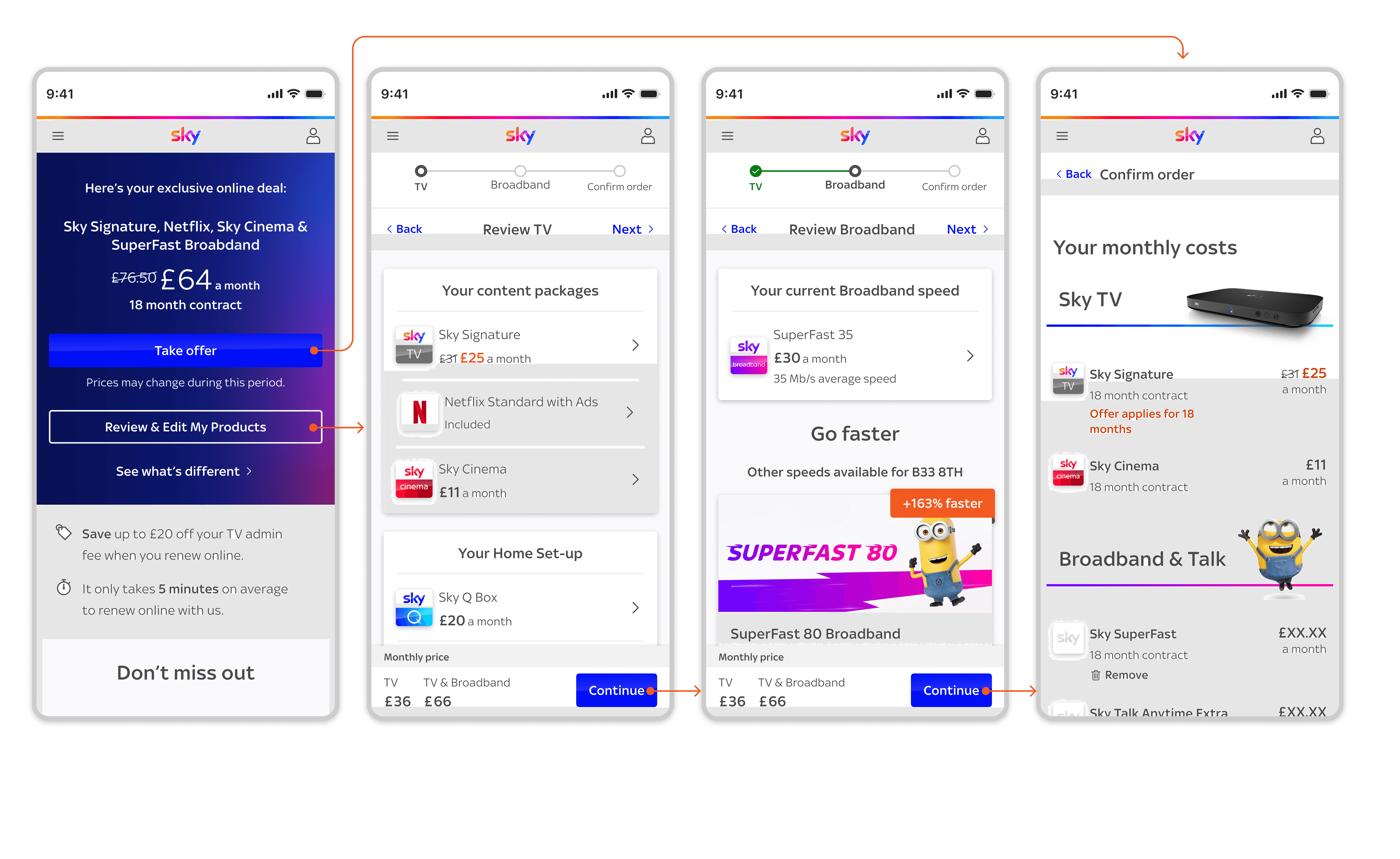
For the second test, I focused on ease of use and task completion. I created a prototype with an overview page and optional actions to edit either the TV or Broadband contract (Version A) and a linear, step-by-step process (Version B).
Both prototypes incorporated the approach of having actions to satisfy two different types of users: “I don’t want to change anything, just let me re-contract at the click of a button” “I want to review and make changes” Both prototypes included the same add and remove interactions for TV and Broadband that had tested well on the previous test.
ROUND 2 USER TESTING
For the second test, I focused on ease of use and task completion. I created a prototype with an overview page and optional actions to edit either the TV or Broadband contract (Version A) and a linear, step-by-step process (Version B).
Both prototypes incorporated the approach of having actions to satisfy two different types of users: “I don’t want to change anything, just let me re-contract at the click of a button” “I want to review and make changes” Both prototypes included the same add and remove interactions for TV and Broadband that had tested well on the previous test.
Qualitative test
Methodology
UserZoom Think-Out-Loud study
Participants
12x Existing Sky TV customers
Task
Participants were asked to remove Sky Cinema, add Sky Sports and upgrade their Broadband while completing the task of re-contracting, using two prototypes in a randomised order.
Qualitative test
Methodology
UserZoom Think-Out-Loud study
Participants
12x Existing Sky TV customers
Task
Participants were asked to remove Sky Cinema, add Sky Sports and upgrade their Broadband while completing the task of re-contracting, using two prototypes in a randomised order.
Qualitative test
Methodology
UserZoom Think-Out-Loud study
Participants
12x Existing Sky TV customers
Version A Main Flow
Version B Main Flow

Remove Cinema

Add Sports

Upgrade Broadband

KEY INSIGHTS
The majority of users found the step by step linear journey much easier to navigate than needing to click into TV and Broadband separately.
All participants found the tasks of adding and removing TV and Broadband easy to complete.
This gave us a clear path forward with our overall journey structure and navigation.
KEY INSIGHTS
The majority of users found the step by step linear journey much easier to navigate than needing to click into TV and Broadband separately.
All participants found the tasks of adding and removing TV and Broadband easy to complete.
This gave us a clear path forward with our overall journey structure and navigation.
NEXT STEPS
Move forward with the linear, step by step approach taken in Version B for the navigation structure of the journey. Start focusing on optimising specific steps in the journey.
NEXT STEPS
Move forward with the linear, step by step approach taken in Version B for the navigation structure of the journey. Start focusing on optimising specific steps in the journey.
FINAL BLUE SKY PROTOTYPE
The finalised prototype incorporated the step-by-step approach and add and remove patterns that had tested well on both tests.
FINAL BLUE SKY PROTOTYPE
The finalised prototype incorporated the step-by-step approach and add and remove patterns that had tested well on both tests.

MITIGATING BILL SHOCK
There was a known issue with the way our basket retrieves pricing data that results in bill shock.
If there were products on a stepped offer, the total monthly price would only display the pricing for the initial offer increment and not account for the fact that during the duration of the contract, the offer would expire and the customers bill would unexpectedly go up.
I proposed a solution to this by introducing a Timeline View feature to our basket. I made a suggestion for an algorithmic approach that could be taken to display certain messaging based on detected reasoning for price changes and user tested approaches. This feature has now been incorporated into the global shared checkout for Sky.
MITIGATING BILL SHOCK
There was a known issue with the way our basket retrieves pricing data that results in bill shock.
If there were products on a stepped offer, the total monthly price would only display the pricing for the initial offer increment and not account for the fact that during the duration of the contract, the offer would expire and the customers bill would unexpectedly go up.
I proposed a solution to this by introducing a Timeline View feature to our basket. I made a suggestion for an algorithmic approach that could be taken to display certain messaging based on detected reasoning for price changes and user tested approaches. This feature has now been incorporated into the global shared checkout for Sky.

TRADE OFFS & DATA SOURCES
I worked with some of the tech leads to figure out a phased approach to building these features and capabilities which were quite large, with each phase being released as a live A/B test.
With resolving bill shock being the highest priority on the list, the first release would involve a simple summary page and a basket including the Timeline View feature.
There were several backend and data issues severely impacting the experience that we worked together to find interim solutions for, mapping out the different solutions and trade-offs.
I presented the options to our department Director and relevant Products Heads to finalise a way forward.
TRADE OFFS & DATA SOURCES
I worked with some of the tech leads to figure out a phased approach to building these features and capabilities which were quite large, with each phase being released as a live A/B test.
With resolving bill shock being the highest priority on the list, the first release would involve a simple summary page and a basket including the Timeline View feature.
There were several backend and data issues severely impacting the experience that we worked together to find interim solutions for, mapping out the different solutions and trade-offs.
I presented the options to our department Director and relevant Products Heads to finalise a way forward.

DIRECTORS' PLAYBACK
The Product Manager and I had an in person “wall walk” with all of the Directors from our department - DCLabs.
A wall walk at Sky is where we print the flow off at large scale and stick it to the wall, talking about the strategy as we walk through and anwer questions. The PM gave an overview of our objectives before I took everyone through the Blue Sky journey and the phased releases, answering their questions about the UX and UI along the way.
The journey was well received and we had backing from leadership to invest in the Basket Timeline.
DIRECTORS' PLAYBACK
The Product Manager and I had an in person “wall walk” with all of the Directors from our department - DCLabs.
A wall walk at Sky is where we print the flow off at large scale and stick it to the wall, talking about the strategy as we walk through and anwer questions. The PM gave an overview of our objectives before I took everyone through the Blue Sky journey and the phased releases, answering their questions about the UX and UI along the way.
The journey was well received and we had backing from leadership to invest in the Basket Timeline.
PHASE 1 PROTOTYPE
I created a handover document outlining the flow, page templates, features and components needing to be built.
PHASE 1 PROTOTYPE
I created a handover document outlining the flow, page templates, features and components needing to be built.
Body copy

DESIGN SYSTEM
I created components and templates to ensure consistency across all re-conracting journeys.
DESIGN SYSTEM
I created components and templates to ensure consistency across all re-conracting journeys.

Outcome
The first release included a reduced journey for the MVP of interstitial (explainer) page to basket and the timeline view in basket feature. The timeline in basket has since been adopted into the global shared basket for sky.com. We’ve since launched an entry-point experiment that delivered a 51% (12.5k) conversion increase from the entry point, and begun adding the TV and Broadband steps, which resulted in a 4% (8.2k orders) uplift from re-contracting journey starts and a call reduction benefit of 16k calls.
Outcome
The first release included a reduced journey for the MVP of interstitial (explainer) page to basket and the timeline view in basket feature. The timeline in basket has since been adopted into the global shared basket for sky.com. We’ve since launched an entry-point experiment that delivered a 51% (12.5k) conversion increase from the entry point, and begun adding the TV and Broadband steps, which resulted in a 4% (8.2k orders) uplift from re-contracting journey starts and a call reduction benefit of 16k calls.