Redefining how millions of customers manage their Sky products.
I led the strategy and execution for the future Manage Hub experience, expected to become the My Sky app's primary destination, while also establishing the reusable systems, patterns and cross-product framework needed to scale the experience across product teams.
Impact
+15.6%
Findability across 10 TV & Broadband journeys
100%
Design system adoption on new app pages



Problems and opportunities
Fragmented Manage experiences
Today's My Sky experience is fragmented across product-specific hubs, making it difficult for customers to understand and manage their complete product holding.

Evidence from call centre analysis
Analysis of approximately 8,000 customer calls highlights recurring needs that customers face in Digital:
Ideation
Tapping into existing knowledge and exploring solutions
Stakeholder workshops
PM Dave Howe and I held a series of workshops with Product Heads, Directors and Tech Leads.
I ran a card sorting session where we analysed the IA of Manage today and product leaders from across the portfolios organised actions and data in order of priority based on their knowledge of their customer base.
Followed by a crazy 8's brainstorming session where I ran through a presentation of pain points and opportunities which formed a collection of "how might we" themes to ideate on.

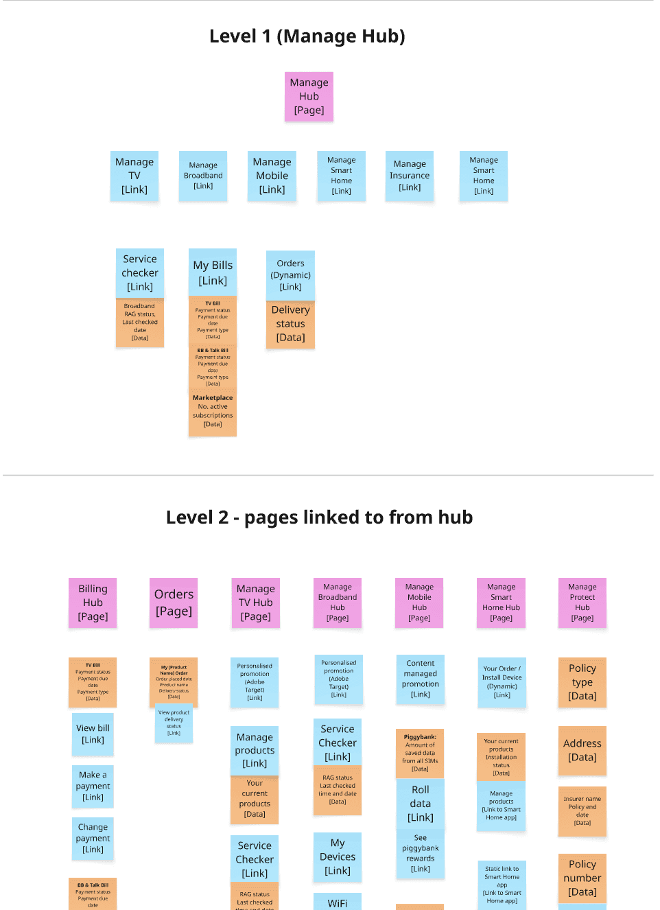
Early IA thinking
Using low fidelity wireflows helps me zoom out and consider the entire architecture and how it intertwines with user flows. Piecing things together and exploring different patterns rapidly.

Package snapshots
I explored an idea where a snapshot of key information related to bill, package and service status could be surfaced for each product. Helping customers understand "What do I currently have and what am I paying. Are there any issues I need to resolve".
However, this created quite a busy UI which could cause cognitive overload. Using data from Abode Analytics to understand most frequented journeys, I started considering what could be offloaded into the widget menus.

Manage options


Solving fragmented package management experiences
Global package builder
I pitched the idea of creating a standalone place for customers to edit their entire package with Sky.
Creating a business benefit of having less technical infrastructure to maintain alongside the customer benefit of being able to right-size to a specific price point.
I identified shared use cases for where this would optimise other journeys I was working on: re-contracting and home move. Potentially expanding to new customer journeys.

Early package builder exploration
Exploring upgrade and browse patterns.

Package builder prototype
Demonstrates package builder working as an onwards journey for re-contracting and organic package editing traffic from the Manage Hub. Exploring how the basket is accessed if user navigates back before checking out.
Proposed solutions
My Sky app design system and patterns
To solve the fragmented experiences, I advocated for the app to be built with a systems-first approach and incorporate UX patterns for key package management tasks. I created a concept library of variables, components, interaction patterns and standardised journeys to be used across each product holding for key tasks.
I organised manage key tasks intro three themes: Understand, Change and Troubleshoot.
Standardised journeys
UX patterns standardise journeys and functions that will be available in multiple places throughout the app.
`I incorporated app native upgrade patterns and a Product Details Page template I had worked on the year before which achieved a 46.9% conversion increase for Sky Sports and a 14.8% increase for Sky Cinema.
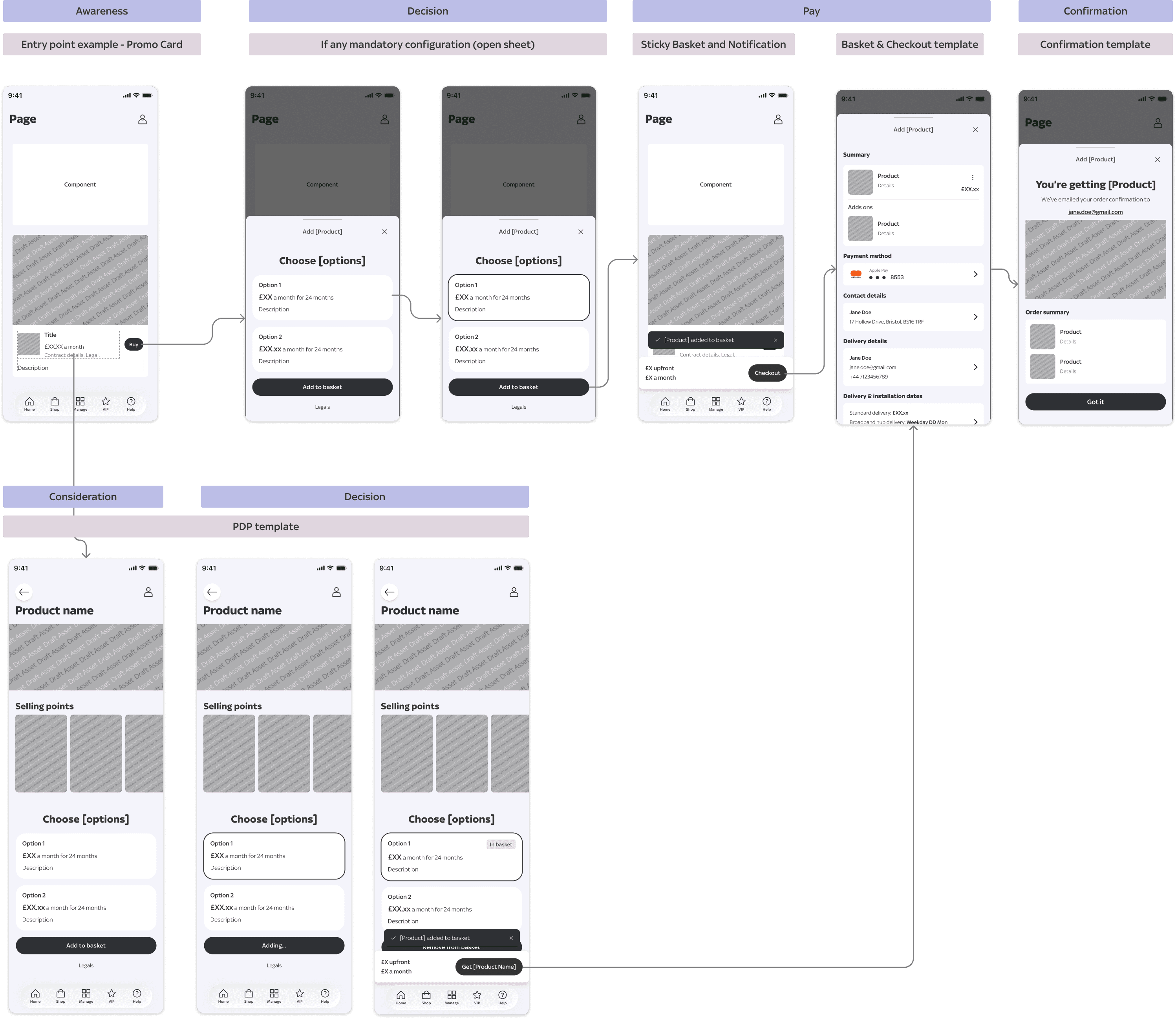
Templates
Support standardised journeys.
Components
Composable modules balance consistency and flexibility.
Widget-Based Manage Hub
The initial concept focused on bringing key information and actions closer to customers through a widget-driven experience.
The objective was to reduce reliance on long, multi-step journeys and surface valuable information earlier.
Tasks from the widget menu were organised in a cohesive structure linked back to the original themes of understand, change, troubleshoot.
Existing
Siloed product hubs. Different IA structures and journeys across products.

Proposed
Unified Manage Hub. Key information and actions surfaced upfront through widgets.

Pivot
Executive challenge and pivot
The proposed solution was presented to an Executive Steering Group. While feedback was positive, leadership challenged the grouping of tasks by product, wanting us to lean harder into an intent-led experience.
This created a significant challenge because engineering sizing was complete and development was approaching.
I had approximately one week to rethink the approach.
Pivot to intent-led task IA
Alongside delivery planning, I reframed the information architecture around customer intent and worked with the Design Director to validate the direction.
We moved from a structure of:
Product → Relevant information → Action
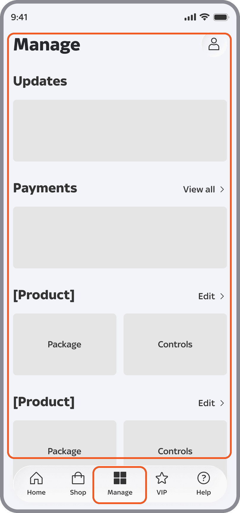
To:
Customer intent → Relevant information → Action

Additional optimisations
The new North Star expanded on the intent-led model through:
• Embedded actions
• Micro-interactions
• Motion design
• Proactive recommendations
The work was well received at the next Exec steering group and described as “world class design”, later included in an inspiration deck put together by our Director to demonstrate the aspirational direction of design for the team.
Pivot
Validating new IA with find-ability tests
Given the scale of the IA change, validating discoverability of existing key journeys was critical. Testing the current experience, MVP and North Star separately allowed us to distinguish whether the IA change itself improved findability, and whether the additional North Star interaction model created further gains.
I designed a testing framework focused on find-ability to all pages with over 5% visits on the app, asking users to complete a key task from each page, starting from the homepage.
6 x UserTesting.com interaction tests
30 participants each.
12 management tasks for TV & Broadband customers
6 management tasks for Mobile customers
Three versions of the app:
Current
First release (MVP)
North Star
Results - TV & Broadband customers
Results - Mobile customers
Outcome
First release of new My Sky app
Despite a last minute pivot, the new design is on track to meet the original release date with no compromise to systems foundations.
With engineering already sized, I prioritised the structural IA changes for the first release while keeping more ambitious embedded interactions and motion for the North Star.
Next steps
Scaling beyond the Manage Hub
As more product teams began contributing to Manage, I identified a risk of teams independently recreating management patterns.
I established a cross-product Manage Design Framework containing:
The Manage vision
Best-practice principles for Controls, Package and Bills
Standardised journeys
Reusable patterns
Links to current product work
I then ran showcases with the TV, Broadband, Mobile and other design teams to establish a shared reference point for future work.
Design principles for manage

Service first. Sales second
Focus first on helping customers achieve their goals quickly and confidently.

Reduce journeys into actions
Where possible, replace traditional multi-step journeys with contextual, interactive experiences.

Prioritise relevance
Design experiences around the customer's products, circumstances and lifecycle moments.
Conclusion
What I learnt and what I’d do differently
Solve pain points, but don’t forget to push the boundaries
Initially I had focused on trying to solve all the known pain points for our customers and architecture. The pivot from leadership pushed to explore how we go beyond solving problems and establish Sky Digital CX as a world class design team.
Make time for validation
I had to make a trade-off between setting up the design system and running Manage Hub validation testing. Testing results would have made a stronger case against a last minute stakeholder pivot. While I still maintain the design system setup was more imperative, if I was faced with this challenge again I would run a quick test that didn’t require observational analysis such as an interaction test through usertesting.com.
Design for the ecosystem, not just the screen
The project reinforced that successful cross-product design requires more than a strong experience. It requires shared principles, patterns and ways of working that allow multiple teams to contribute without fragmenting the experience.